Chartio – Migrating with Confidence

Chartio – Migrating with Confidence

Since its launch in 2010, of its cloud-based analytics software, Chartio has acquired a substantial base of satisfied customers. However, the recent decision by its new owners, Atlassian, to withdraw Chartio from the market, requires those customers to migrate their analytics to a new tool. The deadline for this change is 1st March 2022. So, the time is short for current Chartio customers to choose a new tool and to plan and implement the transition. This is particularly the case for customers that may also want to take the opportunity to cost-effectively enhance their analytics at the same time as migrating. New tools can offer greater functionality, new analytics possibilities, and worthwhile cost savings.

Oxi Analytics can help clients of Chartio switch to either Microsoft Power BI, Salesforce’s Tableau, or Google’s Data Studio before the deadline. These replacement options are all mainstream tools to which their owners are committed as part of their platform offerings and so a safer option in which to invest. Both Power BI and Tableau offer additional functionality that you could use to enhance your reports and analytics.

We can help you choose the option best suited to your situation and help you migrate. For most users of Chartio, this transition can be completed within two weeks.

We can get all the required information from the current Chartio implementation. This covers data sources, queries, visualisations, users and usage, and report scheduling. We can use this information to create an efficient data model and replicate the reports.

As well as merely replicating the current reporting, we can take the opportunity to explore with you and your users what they find useful in the current Chartio reports and what they might like to be changed while the replication is going ahead. For example, you might choose, while replacing, to take this as an opportunity to make some useful changes, or to plan to enhance your reporting more comprehensively, perhaps as a second phase. Once we understand your objectives, we can suggest worthwhile enhancements and show you the new possibilities.

It may also be possible to take advantage of the migration to replace any third-party tools that you are using to integrate your data sources and structure it for Chartio with more modern and lower-cost alternatives, e.g., tools like Google Big Query, perhaps with the ETL built-in open-source tools like Pentaho and Python, so reducing your ongoing costs.

The work can be done remotely, over online collaboration tools like Zoom, Teams or Slack. We can use this to liaise with your analysts, tech team and users. Once we have access to your Chartio reports and the data sources on which they are based, we can scope the replication work accurately and give you a firm quote.

As you may know, Oxi Analytics is a leading specialist in data analytics, based in London, UK, a Microsoft gold partner for data analytics, a Tableau Select partner, a Google partner and, an expert in Qlik. We are experts in commercial analytics, data science, data engineering, data warehousing and data visualisation.

What are the top three things to get right with your analytics?

What are the top three things to get right with your analytics?

The new generation of analytics tools make it easy to produce visual analytics from data without technical skills. What is important now in analytics is the business and data understanding to create actionable insights.

The top three things to consider when setting up your analytics would be:

  • Aligning business priorities with analytics KPIs
  • Getting the right data for analytics
  • Designing analytics to maximize impact

Aligning business priorities with analytics KPIs

Top management will have already set out the business priorities. They define the competitive strategy of the firm, its strategic positioning, core competencies, operating model, and value chain. They set out what success looks like and decide what matters most. Your job is to fully understand this and to design for it. You will need to talk to the firm’s subject matter experts.

Getting the right data for analytics

Getting the data right begins with choosing from many data sources. These have grown in recent years. Look internally and externally. Consider open, and proprietary, free, and paid-for data. Cast your net wide to find relevant data. Once you have it, put governance, support, and maintenance in place for it as part of your data strategy.

Designing analytics to maximize impact

Design analytics around what matters most to the business and model the data that is most relevant. Make the most of what is possible with the latest analytics tools and techniques.

You match the priorities with the data to create the right design. So, these three things depend on each other.

Some examples of how industries set up successful analytics

The business priorities will reflect the competitive strategy. In the past, military strategy was about picking ground which gave you a positional advantage, concentrating your forces against an opponent’s weak points to give you superiority. As the battle became more chaotic, you would depend on dashing field commanders to exploit tactical opportunities as they arose.

These principles still apply. For example, some businesses seek positional advantage in a brand, others in IP, such as a patent, or copyright. In CPG businesses, where a strong brand is an advantage, a priority will be strategic marketing campaigns. These compete for the attention of consumers and customers in direct competition with rival firms.

Companies that have online presence will use data-driven marketing strategy, marketing analytics, and consumer analytics to out-smart and out-gun the competition. Marketing managers will use tactical initiatives to exploit churn in the market.

In CPG firms predictive analytics are used within sales and operations planning (S&OP) to align supply with demand. In the military, predictive analytics are used to give early warning of an attack. Predictive analytics are used in promotions planning and analysis to help to boost returns. Predictive analytics are used in supply chain planning and analysis to make the supply chain more robust.

Execution and Implementation

Getting the analytics right requires iterations to make successive improvements and get the best result.

Work with users and subject matter experts (SMEs) from across the business – people from both back-room and front-line roles. Aim to co-create the design with them.

  • Talk to SMEs to decide how best to translate the business priorities to dimensions, measures and KPIs.
  • Talk to the people who will use the analytics on the choice of tools. Stimulate their thinking by showing them what’s possible. Listen to their concerns and ideas. Generate enthusiasm.
  • Iterate the design with sprints that create something tangible. This gives SMEs and users something to react to, and to comment on. This will help them to contribute.
Analytics of Sales Consultation Effectiveness

Analytics of Sales Consultation Effectiveness

While there are many ways to monitor sales force effectiveness, the actual course that any individual sales consultation takes can usually only be understood by people that are present. But this is beginning to change, and analytics can now be applied to sales consultations – both
individually and in aggregate.

Out of necessity, during Covid, many more sales consultations with prospects took place online, via meetings on Zoom, for example. Sales consultants became accustomed to screen-sharing content and collateral. This led to the development by some firms of digital sales apps to support the consultants, who then took their prospects through the content modules within these apps. In doing so, these firms “digitised” the sales call, by making it possible to track the content and flow of every call. By combining this new data with sales data, patterns of content and flow can then be related to outcomes.

Tools like Adobe, Segment and GA make it possible to track each sales consultant’s interactions with the digital sales application. They track the usage of digital content and the sequences in which the content is used, producing visualisations of patterns in content usage and flow. These visualisations can be filtered by prospect attributes, sales consultant attributes, types of sales outcome, sales conversion rates and transaction values. Furthermore, flows can be examined more finely, down to flows in, out, and through individual content modules.

These analytics empower sales managers – people who have the experience to interpret these patterns of usage and flow – to create and test hypotheses and make judgements about how to optimise the sales calls for the best results. At the team level, it enables managers to make targeted training and coaching interventions. At the organisation level, managers can design, test and roll out training programmes; and set best practice standards and benchmarks for sales consultations. Practice can then be measured against these benchmarks to eliminate sub-standard, under-performance from the sales teams. Measuring the drivers of success in sales calls not only eliminates under-performance but also enables data-driven, continuous improvements to be made to the quality and effectiveness of sales consultations.

The customer journey and customer experience begin digitally, with online searches and visits to websites. The process then continues digitally through the sales consultation, tracking subsequent sales transactions and customer satisfaction. This digitisation of the sales consultation means that the customer journey, customer experience and customer life cycle can now be tracked digitally from end-to-end. The analytics from all these digital touchpoints can be used to drive interventions to optimise the entire customer experience, greatly enhancing the effectiveness of analysing sales consultations.

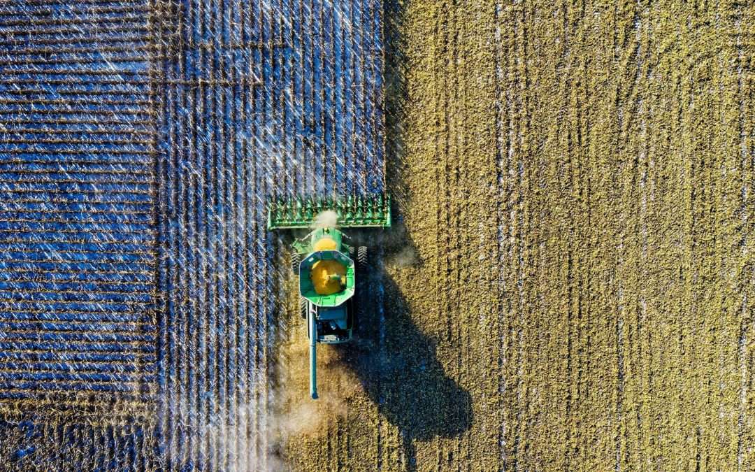
Small Farm, Meet Big Data: How Data Analytics Can Help Transform your Agriculture Business

Small Farm, Meet Big Data: How Data Analytics Can Help Transform your Agriculture Business

The next agricultural revolution is upon us, and farms with big data initiatives are set to see big benefits.

With the world population set to reach 8.5 billion by the year 2030, farming businesses are facing enormous pressures to innovate—and fast. The biggest farms are already using technology to manage their activities, especially in the U.S. where automation is being used to produce more food than ever before.

Now it’s time for the smaller farms to embrace the digital transformation. Large economic potential is linked to big data. And we think it can secure the fortunes of a new generation of digitally savvy farming professionals—as long as you know what it can do and how you can use it.

Building a profitable farm business

Like any business, your farm’s profitability depends on two key drivers: using your inputs to maximise your outputs, and using assets efficiently. For arable farms, inputs are your seeds, fertiliser, agrochemicals, fuel, electrical energy and variable labour. Among your many assets, you have machinery, buildings and of course, the land itself.

On the other side of the equation, you have your outputs. Crops are the obvious output, but we must also talk about the environmental benefits of your farming business as sustainability has a market value in a modern economy.

Productivity is the art of getting the most outputs for your inputs, and that requires careful tracking. Managing your farm without monitoring everything you do is like driving a car with a blindfold. But, whereas once you might have relied on a closeness and understanding of the land to assess yields and predict your productivity, now we have data.

And it’s set to take agriculture to new heights.

New levels of precision, field by field

Fields differ greatly in their productive potential. Soil type, soil conditions, crop choices, preparatory treatments, seed varieties, fertiliser choices, crop protection and application rates and timings all have a major impact. To boost productivity, farmers can benefit from a wealth of rich data from universities and science labs, specifying the benefits of innovative products and new techniques.

Seed, fertiliser and crop-protection manufacturers also put out a ton of guidance on the optimum use of their products—though some of their claims are not independently verified.

Now, thanks to the roll out of 4G and 5G, it’s possible to optimise production even further, right down to the level of the individual field. Sensors placed strategically around fields let farmers ‘see’ their crops from anywhere over large areas, without ever venturing into the field.

Field sensors can tell you to apply different amounts of fertilizer in different parts of a field. Water monitors can give you up-to-the-minute data on how much moisture crops are receiving. These sensors send information in real-time, providing massive insights into crop health.

For crop spreading, spraying and monitoring, we’re seeing an increasing use of drones. These aerial devices are massively time and labour-saving—imagine the return on investment if farmers could seed, spray and satellite-image the soil using a driverless aerial source, without having to charter a plane.

Closer to earth, sensors placed on tractors and farm equipment can provide a wealth of data, from crop inspections to when your machine needs servicing. Farm machines are also an early candidate for autonomous driving, further improving farm efficiency.

Using the past to predict the future

The ability to remotely monitor crops is one thing; being able to predict outcomes is something else. With predictive analytics, a type of statistical modelling, you can use the real-time data collected from fields and combine it with data from the past to predict what currently is happening and what is going to happen. This makes it easier to make decisions that impact the bottom line.

For instance, unexpected weather variations can impact crop yields, and certain crops under certain conditions are susceptible to pests. Inputting a bunch of variables such as weather, soil types, temperatures and moisture levels can help you apply water, fertiliser, pesticides and so on in more precise quantities, specific to crops at the field level, to increase productivity.

Together, these technologies can help you make timely interventions to reduce losses and even enhance yields economically—resulting in higher production with less waste, which is exactly what drives profitability.

Protecting revenue and controlling costs

Both crop revenues and input costs are susceptible to the pricing gyrations that are inevitable in commodity markets—sometimes exacerbated by government interventions. Some, but not all, of these variations can be hedged. Still, most farmers, as they go through the year, will have an up-to-date prediction of the revenues and profitability they expect to realise at the end of their financial year.

Data is another weapon in the arsenal, ensuring the accuracy of your predictions.

Overall, optimisation has led to higher yields and higher gross profits, though the percentages vary by farm type and size. Cropping enterprises manage 61% Gross Profit on average. Input costs for seeds, fertilisers and crop protection amount to 90% to 95% of variable costs. As we have seen, different fields have different yield potentials. The law of diminishing returns applies, too, so at some point, adding more fertiliser is not going to raise your output.

In other words, there’s an optimum productivity target that can be set for each field and each crop, as well as an overall optimal efficiency level for every farm. Optimising the ratio between yield and inputs at the field level is a major driver of improved gross profits.

Securing the future of the farm … and the planet

Small, family-run farms make up the bulk of the farming sector globally and here, farming remains a low-tech, low-yield enterprise. But falling costs means that data and analytics tools will soon be accessible to the many. On a global scale, data, analytics and automation have the potential to transform agricultural productivity and sustainability, fighting hunger and slowing climate change.

It is a compelling economic reason to roll-out digital infrastructure globally.

Closer to home, data can help you understand and record the direct costs and opportunity costs of the actions you are taking to protect the environment, protect wildlife and mitigate climate change. This supports a claim for the government payments that are made to reward farmers for their stewardship of the countryside.

Some of the government payments to help farmers to be productive and sustainable should arguably be directed to establishing the infrastructure needed to support the new tech. Improving the profitability of farms will attract more investment into the sector and encourage a positive cycle of investment, increasing productivity and sustainability.

It all helps you increase the quality and predictability of earnings (EBITDA), and therefore the value of the farm. This in turn attracts investors to the farming sector and backing for farm managers with proven effectiveness.

Small farm, meet big data

For big data to work, farms need a data warehouse to centralise and consolidate large amounts of data from multiple sources. This technology pulls all the various data sources together, so you have all your cropping plans, field conditions data, farming activities, interventions, financial records, energy usage and so on all in one place. The data warehouse is the farm’s ‘single source of truth.’

Then, you need a data visualisation tool which translates the data into actionable insights for farm managers and staff, so that everyone can make the right decisions based on what the data is telling you. Visualisation brings to life a vision of real-time farming in which the raw data allows all your inputs to be monitored and managed in real time.

The bottom line here is that the future of agriculture depends on its digital transformation. Farmers who embrace the new technologies will benefit from better yielding crops, more predictable outputs, and the ability to manage their activities in more efficient ways. Farmers must aggressively adopt data and analytics—or be outperformed.

Want to continue the conversation? Speak to an expert in agricultural analytics, and find out how we can help your business farm smarter today.

Daily Active User Overview with Google Data Studio

Daily Active User Overview with Google Data Studio

Are you interested in leveraging Google Analytics to maximise the value of your data? In this article, we'll review the Google Data Studio and break down how data analytics is transforming business.

What is a 'Daily Active User'?

A Daily Active User (DAU) represents the total number of visitors who engaged with a web product or a mobile app on any given day. It also details how often each visitor comes back to your website/app.

Not sure how data analytics is transforming business? Even though active user data is added by default to all Google Analytics accounts, DAU should not be overlooked! This incredibly useful feature can predict trends like the effectiveness of a particular promotion and tracking user interest, as well as measuring the growth rate of a product.

Defining the DAU metrics

In order to master data management, you'll need to understand the metrics. DUA metrics are relative to the last day of the date range you are using for the report. For example, if your date range is the 1st – 28th May, 1-Day Active Users would represent the number of unique users who initiated sessions on your site or app on May 28 (the last day of your date range). 28-Day Active Users indicates the number of unique users who initiated sessions on your site or app from May 1 through May 28 (the entire 28 days of your date range).

Visualising the DAU metrics

DAU metrics are generally either displayed using scorecards, a time-series chart, or a table. Except for scorecards, visual analytics will only be able to display one DAU metric at a time. Viewing both 1-Day and 7-day Active Users at the same time is not possible without some workarounds.

For easier comparison, you will want to have all the DAU metrics on a single chart. Google Analytics allows up to five data sources to be combined, whether you are doing a self-blend or a blend of different sources.

Below is a step-by-step guide on how to get all the DAU metrics into a single table:
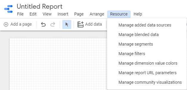
We will be using the Google Merchandise Store for this demonstration. Presuming that you have created a Google Data Studio report and have connected it to Google Analytics, in Data Studio, click on the 'Resource' option from the menu bar followed by the 'Manage
blended data' option.

Google Analytics

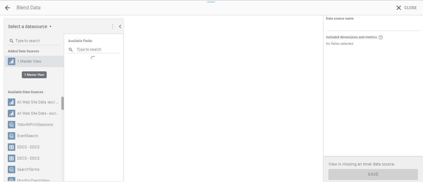
A new window will appear, where you will be given the option to ‘Add a data view’. Once clicked, this window should appear:

Google Analytics

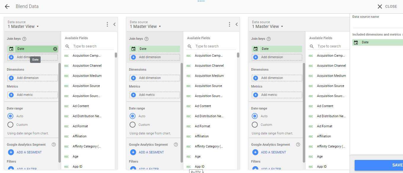
Select ‘Master view’ as the first data source. Once given the option to add another data source, click on it and add the ‘Master view’ again. Repeat this process until you have all five data sources.

In the first source, add the ‘Date’ dimension as the ‘Join key’. This will add the ‘Date’ as the join key across all the sources.

Google Analytics

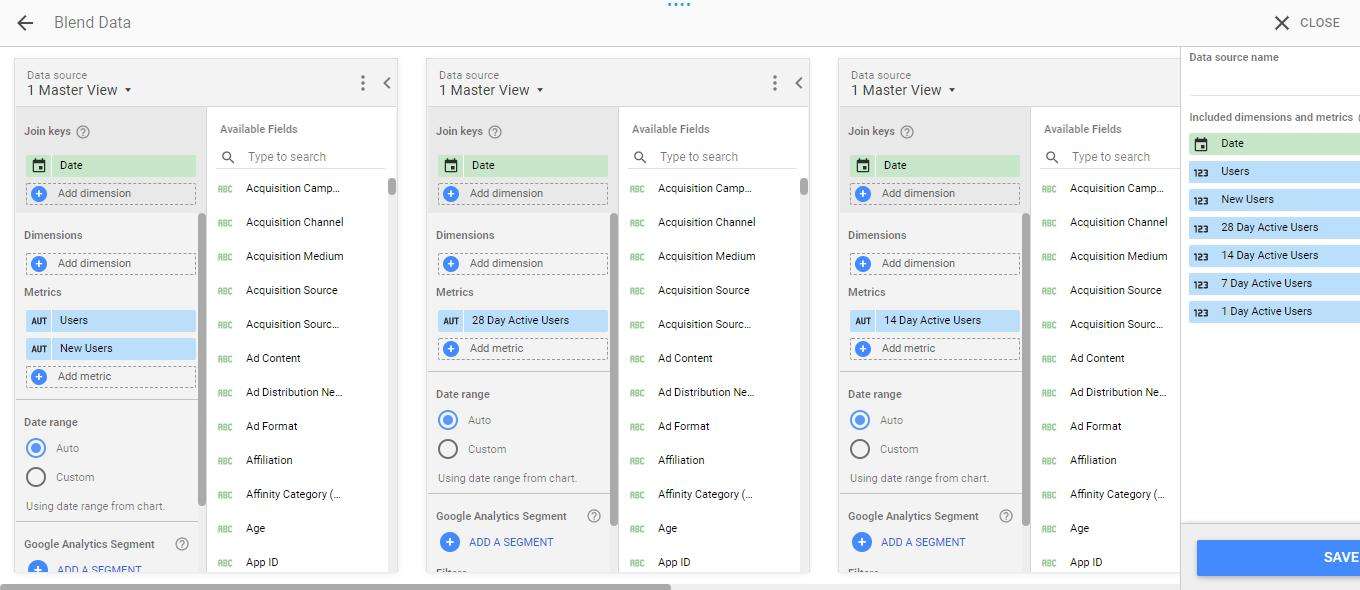
Next, in the first source, under ‘Metrics’, add ‘Users’ and ‘New Users’. This will allow you to see the total number of users and new users visiting your website.

For the remaining data sources, add ’28 Day Active Users’, ’14 Day Active Users’, ‘7 Day Active Users’, and ‘1 Day Active Users’ in that exact order. Save using a name of your choice, and your blend is ready!

Google Analytics

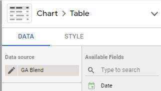
In the report, click on the ‘Add a chart’ icon, followed by the ‘Table’ option. In the ‘Data source’ section of the table, select ‘GA Blend’ or the name of your blend as the data source.

Google AnalyticsGoogle Analytics

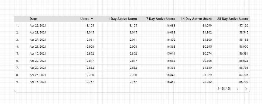
Add ‘Date’ under the dimension and select ‘Users’ along with all DAU’s under the metrics section of the table. Your table should look something like this:

Google Analytics

There you have it! You will now have all the DAU metrics in one single table.

Supply Chain Resilience and How Visualisation Tools Can Be Beneficial

Supply Chain Resilience and How Visualisation Tools Can Be Beneficial

How supply chain resilience is used in businesses

The resilience of supply chains has been tested in recent years by some catastrophic events and by political disruption to trade flows. Supply chain managers have developed some pragmatic approaches to risk management and some useful tools, including the ability to visualise supply chain dynamics.

These tools visualise the flow of material, components, and products from source to destination via nodes showing locations, facilities, and distribution points. The visualisations include data such as inventory levels of components and spare parts at supply chain storage locations and depots.

How visualisation can play a crucial part in supply chain resilience

The visualisations can be filtered by the attributes of the flow, such as, product categories, products, brands, component subsets, sub-assemblies, and SKUs. The visualisations allow for the flow of specific locations and facilities to be seen and understood by a time frame. The visualisations are automatically refreshed from digital sources in the supply chain locations and so are always up to date. The visual tools are used by supply chain managers to ensure that the supply chain is resilient to a range of commonplace, but lower impact disruptions. For example, by increasing inventory levels to reflect the risk level. For rarer, but higher-impact events the visualisations will inform the rapid recovery actions that need to be taken. Issues such as climate change seem to be increasing the rate at which events occur that can have a high impact on supply chains. Therefore tools that support the ability to recover from disruption and losses quickly have a high utility.

The analytics tools used include Adobe Analytics, Microsoft Power BI, Tableau and Qlik. The visualisations are not out of the box, but purpose-built to provide the filtering and drilling functionality that is required to understand potentially complex patterns of product and component flows. The calculations are also purpose-built to provide the appropriate calculations of inventory cover, supply chain velocity and working capital requirements. All of which reflect the potential impact of disruptions on cash flows and cash requirements.

The effectiveness of visualisation tools relies on the quality of the data engineering and data modelling on which the visualisations are based,
as well as the power of the filtering and the functionality that permits drill through of supply chain complexity. Visualisation tools provide a means of engaging people and processes in the cost-effective improvement of supply chain resilience.

Contact one of our experts to discuss how supply chain resilience and visualisation tools can benefit your business today